As I rode the rails of my commuter train this morning I saw a beautiful picture. The waters of the usually turbulent Pitt River were still, offering reflections of distant mountains and shorelines that were near perfect. I have crossed over that rail bridge a thousand times, but never before seen it that way.
With the sun low in the sky and the train traveling at 50 miles per hour, the structure of the rail bridge and the safety glass window, it was not a picture that could be made. Even if I had cranked up the ISO on the D3 to allow a blazing shutter speed, shielded the glass to cut reflections, and timed the shot perfectly to avoid the iron struts of the bridge, I could not have got the shot. Certainly, I could have made a clear and sharp image, but not the image I was seeing with my eyes.
I have learned that sometimes a moment is meant to be appreciated in it's pure form; that a camera is an intrusion. I would have been disappointed by the result had I tried. Instead, I appreciated the moment for what it was, and when I close my eyes I still see it.
I have had many of these moments over the years, pictures recorded only in my mind. Some so profound that I can still see them clearly though they happened long ago.
One of the most important things for a photographer to learn is when not to go for the camera, just to appreciate and remember.
Today, I have only that memory to share.
Showing posts with label Digital Photographer. Show all posts
Showing posts with label Digital Photographer. Show all posts
Thursday, May 13, 2010


Wednesday, May 12, 2010
Logo Madness
Today I set about designing a new Logo for the website. Every time I design it's an exercise in frustration. Problem is that there are no limits. 16.8 million colors. Any size, Any shape. Four million images to choose from. A logo is supposed to say something about the company, but what is it that I want to say?
Something Artsy, but not too artsy. Don't want to alienate anyone. Can't use something too sexy because inevitably someone will complain about that. Not something too conservative because I'm not.
I settled on an image of the City of Vancouver that has been very successful for me. It speaks of where I call home, where I work, where I play. It makes a great backdrop and it's sexy without being too sexy so no-one will call and complain but it's not too conservative either.
Okay, got the picture. Then what? How about a little DKNY influence - the city within the text. It needed more so I dropped in the complete background image and de-saturated it, dropped the contrast, and voila! The city is continuous in the image, flowing through the text.
Several hours later.....

and Tomorrow is another day. Cheers!
Something Artsy, but not too artsy. Don't want to alienate anyone. Can't use something too sexy because inevitably someone will complain about that. Not something too conservative because I'm not.
I settled on an image of the City of Vancouver that has been very successful for me. It speaks of where I call home, where I work, where I play. It makes a great backdrop and it's sexy without being too sexy so no-one will call and complain but it's not too conservative either.
Okay, got the picture. Then what? How about a little DKNY influence - the city within the text. It needed more so I dropped in the complete background image and de-saturated it, dropped the contrast, and voila! The city is continuous in the image, flowing through the text.
Several hours later.....
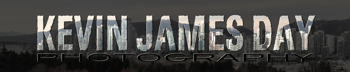
and Tomorrow is another day. Cheers!
Subscribe to:
Posts (Atom)


 Posts
Posts

